Thursday, 4 November 2010

Andy's First Assignment, Part B

This is a long candid shot taken from the feature film ‘Pursuit of Happyness’ (Muccino, G. 2006). The sequence involves the main character ‘Chris Gardner’, Will Smith’s character who has just picked up his (in and out of film) son ‘Christopher' from play school.

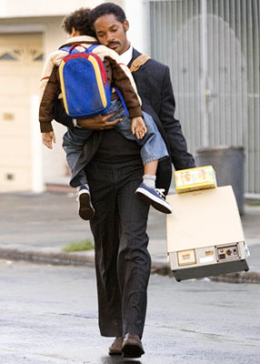
The short focus shot reveals a location and the two main characters representing how the characters are most important, although it is obvious that the location is somewhere within a suburban city in America due to the typical pavement and common building designs.

The image’s angle is at eye level keeping the composition fairly neutral, making it seem as though the readers are a person at that present time observing. In the background a building has a metal barred gate, which could be argued for safety reasons giving connotations of a rough area. The composition has no bright or happy colours apart from several on the little boy’s bag centred in the middle of the shot which could symbolize the lack of happiness in their life yet the boy is the only small part of happiness left.

‘Christopher’ is being carried by one of his father’s arms, yet he is not holding onto him for support or affection giving the audience a sense of how ‘Chris Gardner’ is alone and has no one looking out for him or to confine in. How ‘Chris Gardner’ is holding the child seems to resemble a shield as if he’s the only thing keeping him from breaking point. Will Smith’s character is carrying in his other hand an unusual looking cream covered machine. It is a bone density scanner, which he attempts to sell however they are seen as overpriced and unnecessary. The machine mirrors the cream door on the right of the composition, which could be argued as a connotation of their home because it is recognizable to them and is the only material object they have left resembling their house and to state as theirs. The abnormal machine is not a stereotypical item anyone would think of when a man in a suit is present. A signified concept of a suit is a smart business outfit, which over time has created the myth that if a man wears a suit he is a heterosexual, authoritative and independent man in control of his life. This could give illusion that the main character is in disguise and is trying to better himself because the decoders know that he doesn’t fit the present myth due to the lack of money and power, however this could suggest his past will not let him become what he aspires to be, which suggests that the text is reinforcing ideology about captialist patriarchy.

The two characters are black and poor which link back to a myth about the past and how the white were in power and had the money in opposition to the black people who were slaves to the white and got paid hardly anything. It could be argued that the director did this to remind the audience about the capitalist issue of patriarchy. It is debatable that Gabriele Muccino wanted his film to have the preferred reading that the audience will want to care for the twosome, want them to be protected, have a nice home and enough money to have a secure and happy life. If this is the case and the preferred reading has been accepted it shows how the past white versus black hegemonic rules shouldn’t apply because black people are the same as the rest of us.

Tuesday, 12 October 2010

Analysis Using Connotations/Denotations

To the left is a campaign made by 'United Colors of Benetton' a fashion corporation widely known for its extravagant and shocking advertisments.

The denotations of this image would be a white and black man hancuffed together both wearing denim jeans and jackets with a lighter blue shirt underneith. In the top right corner is the companys iconic label.

The connotations would be that the two men are equal. Plus with the label being green this connotates a neutrality again agreeing with the men being equal.


Monday, 11 October 2010

Yes, its another film review!

Directed: Rodrigo Cortes
Written: Chris Sparling
Running Time: 95 minutes
****

As soon as I saw the trailer for this I knew it was a risk it was either going to be Ryan Reynolds in a box for the whole duration or cut to additional scenes above the ground introducing alternative characters. I was pleasantly surprised that although it was just Reynolds character Paul Conroy in the box it did keep me entertained.

If you're looking for a stereotypical Hollywood ending this is not the film for you. Rodrigo Cortés' use of lighting and sound help keep you wanting to know more and sends you through a variety of emotions.

Saturday, 9 October 2010

Text and the City Assignment

Assignment One: Text and the City (Ashley Morgan)
'Take three photographs of written text found on buildings which you think sum up the essence of Cardiff city'. 
 
Image one: Primark
My first thought of Cardiff is and always will be Primark. It was the reason I first ever came, and kept returning.

The store is in the centre of the shopping area. 'Primarks' sign is positioned centered on the building just above its doors to make it clear of the store. It's font in a basic serif font helping it be approachable and readable.

The image is taken from below and to the right of the building tilting upwards, I did this to create an overpowering emotion to represent the greatly established corporatation.

I wanted to include people going inside the building as well as out in the compostion due to the fact that the business is about people and would not survive without us. I liked how in this frame there is a predominant theme of the colour pink and blue. The blue building gives off an unemotional robotic feel to the company which with the pink women and other people help create a mood and atmosphere.   

Image Two : Tigertiger 
My second photograph was chosen because it was the first ever nightclub I went to in Cardiff and one of my favourites of all time, so it had to be one out of the three. The club is a few streets from the shopping centres and castle giving it easy access and helping it been seen by the masses.

I left a large space of the building above the club's sign because I liked how it left the reader's imagination to visualize the character and atmosphere within. I really like how the sign for Tigertiger is in all lowercase and has a mixing colour scheme to show its laid back, fun personality and character in addition to Primark's. The title is also placed above the doors in the middle again to promote its club in a easy, simple manner.


 Image Three: Cardiff Castle
My third representation of Cardiff had to be one of the cities most famous landmarks the castle. Cardiff will always be associated with its castle and its history. The castle is located just off from the shops and next to a busy road making it very visible. It is also positioned on a flat piece of land which makes it clear that it wasn't built for someone as important because it was easier to access and by not being placed on a hill it represents how it did not need to defend itselfs.

The shot is of half of the entrance and has people walking through, on each side of the opening is a sign saying 'welcome' in  various languages all in a sans serif font showing how the whole world come and visit the iconic castle. On the board the iconic Cardiff castle logo is also present. The font is white on a navy board helping the text be seen to all. I wanted to photograph inside the castle as well as the text to create a through the looking glass effect.

Wednesday, 6 October 2010

I LOVE YOU ORANGE WEDNESDAYS!


The Town Review

Directed and written by: Ben Affleck
Running time: 2hrs 4mins
****

Ben Affleck proves he's not just an A list star but also a director to be taken seriously. Although the storyline mimics 'Public Enemy' but with a modern day twist, Affleck is able to create extremely intense scenes in which at least half of crowded cinema were on the edge of their seats quite literally. A definate audience pleaser, Affleck includes all the ingredients to create an unforgettable movie.

Tuesday, 5 October 2010

HELLO FELLOW BLOGGERS!

Hello! My name is Luchia Bennett, I'm 18 years old and come from Bristol, England. Currently in my first year at UWIC studying Media Studies with Visual Cultures. I've been living here for just under a month now in Evelian Court a particular halls of residence for UWIC (one of the closer ones to Landaff campus which is where media is stationed). I feel I have already fit in quite well with my flatmates and class as well as having kept a good time management regime, so all is well. Phew!

The course so far is exactly what I expected which is great and because I have been taught media studies from GCSE up to A level which has helped a great deal because at the moment I know all the terminology, theorists and their concepts making it rather simple for me.
My course is made up by three lectures Andrea Williams, Cath Davies and Ashley Morgan. Each lecture will teach us a specific module, which as it stands Andrea is teaching us 'Constructing Meaning: An Introduction' Cath's is 'Introduction to Theory' and finally Ash's module is 'Being Academic'. All the modules mentioned I am really learning from especially Ashley's because it is helping us write and do things in the correct academic manner.

The main reason i've come to univerisity is to expand my knowledge of the media and all its aspects. Leading me closer to the possibility of getting a job within advertising, something i've always aspired to do. Another reason for being here is for the experience and the chance to do things I would not usually have the opportunities too, so bring it on!

Peace x

CV

Luchia Bennett
Date of Birth: 17/08/1992
Address: Block A Flat 13
Evelian Court
North Road
Cardiff
CF14 3BA

Mobile: 07891130988
Email:
luchiabennett@hotmail.co.uk